Back to Blog
Event Design
The Art of Event Design: Color Psychology in Celebrations
Patricia Chen
December 20, 2024
5 min read
Color is one of the most powerful tools in event design, capable of influencing emotions, setting moods, and creating unforgettable atmospheres.
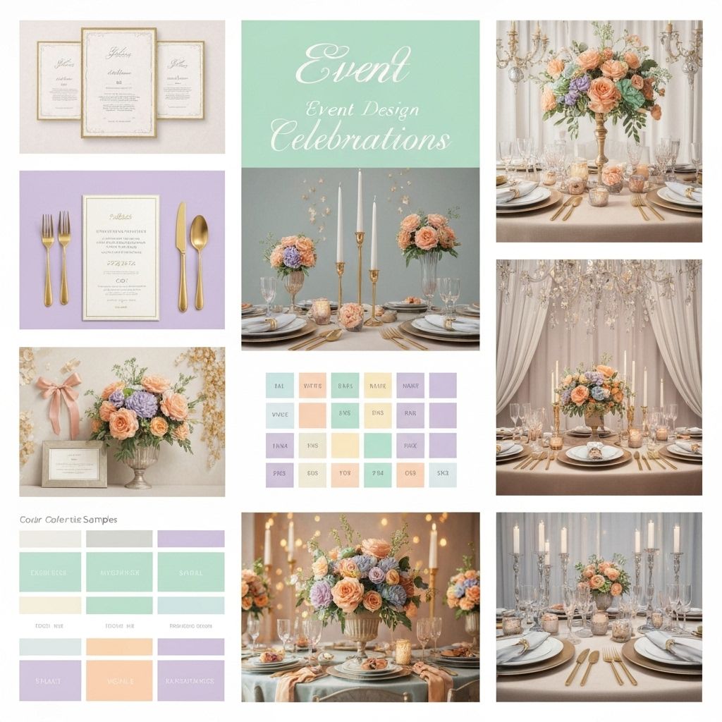
**Understanding Color Psychology**
Different colors evoke different emotional responses. Red energizes and excites, blue calms and inspires trust, while green promotes balance and harmony.
**Warm vs. Cool Palettes**
Warm colors (reds, oranges, yellows) create intimate, energetic atmospheres perfect for celebrations and networking events. Cool colors (blues, greens, purples) promote calm and focus, ideal for corporate meetings or wellness events.
**Creating Cohesive Color Schemes**
Use the 60-30-10 rule: 60% dominant color, 30% secondary color, and 10% accent color. This creates visual balance while allowing for creative expression.
**Seasonal Considerations**
Align your color palette with the season. Spring pastels, summer brights, autumn earth tones, and winter jewel tones feel natural and appropriate.
**Cultural Sensitivity**
Be aware of cultural color associations. White symbolizes purity in Western cultures but mourning in some Eastern cultures. Research your audience's cultural background.
**Lighting and Color Interaction**
Colors appear different under various lighting conditions. Test your color scheme under the actual lighting conditions of your venue.
**Practical Application Tips**
Start with one or two main colors and build from there. Use color in linens, flowers, lighting, and even food presentation to create a cohesive experience.
Mastering color psychology in event design allows you to create environments that not only look beautiful but also feel exactly right for your celebration's purpose and mood.
Never Miss Our Latest Tips
Subscribe to our newsletter for expert event planning insights delivered to your inbox.